One of the most common requirements we see here at Polygon.io is visualizing stock market data. There are dozens of charting tools and libraries that you can quickly add to your apps depending on your need. There is also a growing number of broader solutions for creating data apps, Plotly and Streamlit, being two of the most popular, that not only provide charting and visualization support, but also serve as a great foundation for further data science use cases.
In this post, I’m going to use Streamlit to create a very simple data app for visualizing historical stock data using the Polygon.io Stock API. If you haven’t heard of Streamlit before, it’s a very popular Python framework for ML and data scientists that makes it very easy to create and visualize data with just a few lines of code. Thankfully, there is already some great tutorials online using Streamlit and Polygon, and a lot of code I use below is cloned from this repo.
Set up your basic app
Enough talking, grab a coffee and go ahead and create a new Python app in your favorite editor, or via the command line. Once you have your project set up, go ahead and add package requirements and import the dependencies:
Add packages into requirements.txt
#requirements.txt
streamlit==1.32.2
polygon-api-client==1.13.4
From the command line, enter
$ pip3 install -r requirements.txt
Import the dependencies into your main.py
import os, streamlit as st
import pandas as pd
from polygon import RESTClient
Next, we will set up a basic UI with two input boxes, one to input the Polygon API key, and another to enter a stock ticker symbol. We will also set up authentication with Polygon. You can get your Polygon API key from the Developer Dashboard. If you don’t already have a Polygon account, you can sign up for free. The last thing we will add 3 columns we will add buttons that will trigger our API calls shortly.
st.subheader("Polygon+Streamlit Demo App")
symbol = st.text_input("Enter a stock symbol", "AAPL")

with st.sidebar:
    #Get your Polygon API key from the dashboard.
    #In a real app you want to store this as a secret in your .env
    polygon_api_key = st.text_input("Polygon API Key", type="password")

		# Authenticate with the Polygon API
		client = RESTClient(polygon_api_key)

		col1, col2, col3 = st.columns(3)
Get Stock Details
Let’s start with a very common requirement, getting stock ticker details. Add the following code which adds a button and call to Polygon’s API. To keep things simple, we will display the results in a Streamlit success field.
 #Stock details
if col1.button("Get Details"):
 if not polygon_api_key.strip() or not symbol.strip():
        st.error("Please add your Polygon API Key on the left <--")
    else:
        try:
            details = client.get_ticker_details(symbol)
            st.success(f"Ticker: {details.ticker}\\n\\n"
                f"Company Address: {details.address}\\n\\n"
                f"Market Cap: {details.market_cap}")
        except Exception as e:
            st.exception(f"Exception: {e}")
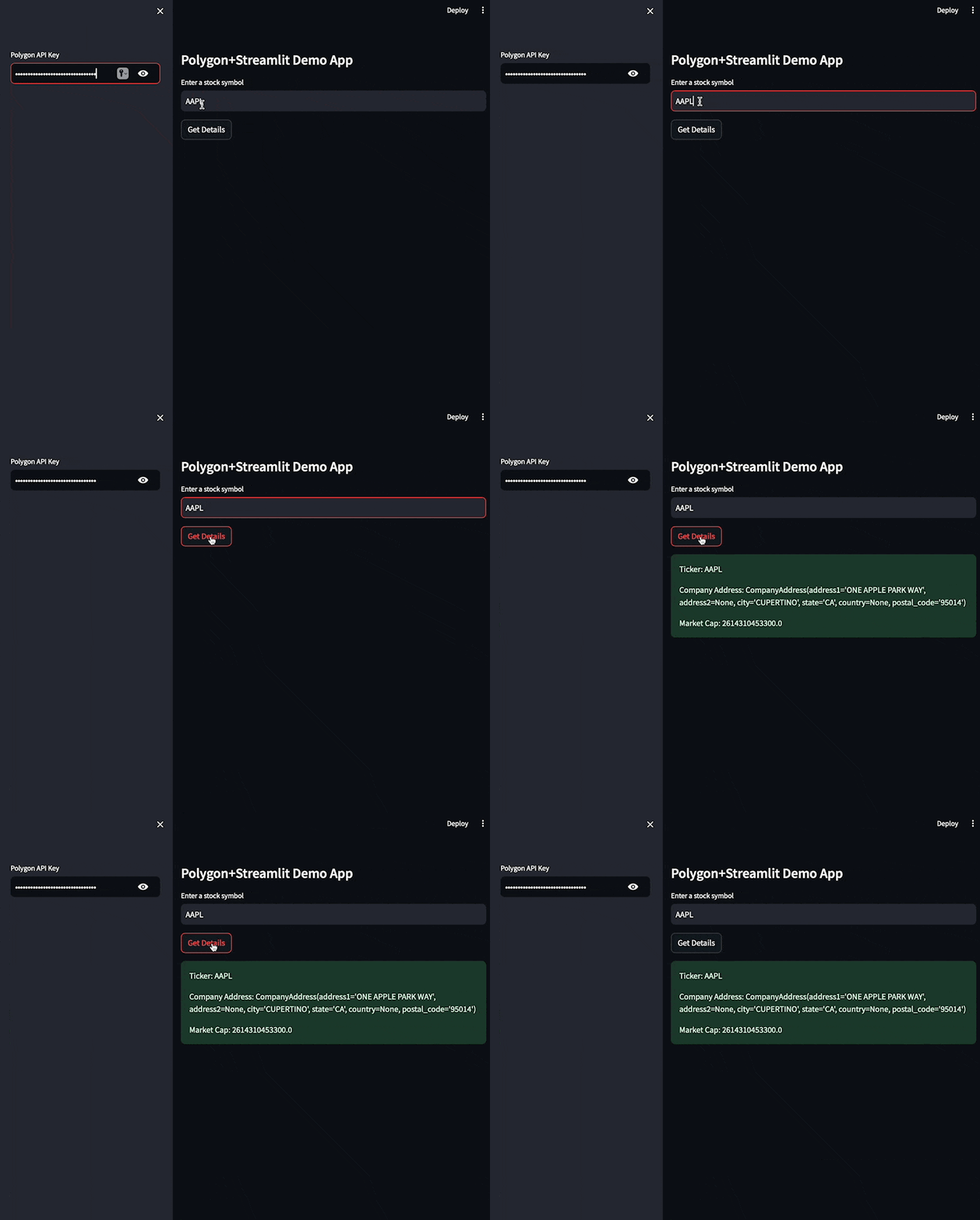
Save and test it but running the following command. Don’t forget to paste in your API key, then tap Get Details. Upon tap, you should see the results of the API call in green box.
$ streamlit run main.py

That’s it! Streamlit eliminates all the work to create UI and you can see how easy it is to use the Polygon libraries to fetch data and display it in the app.
Get Yesterday's Open, High, Low, and Close
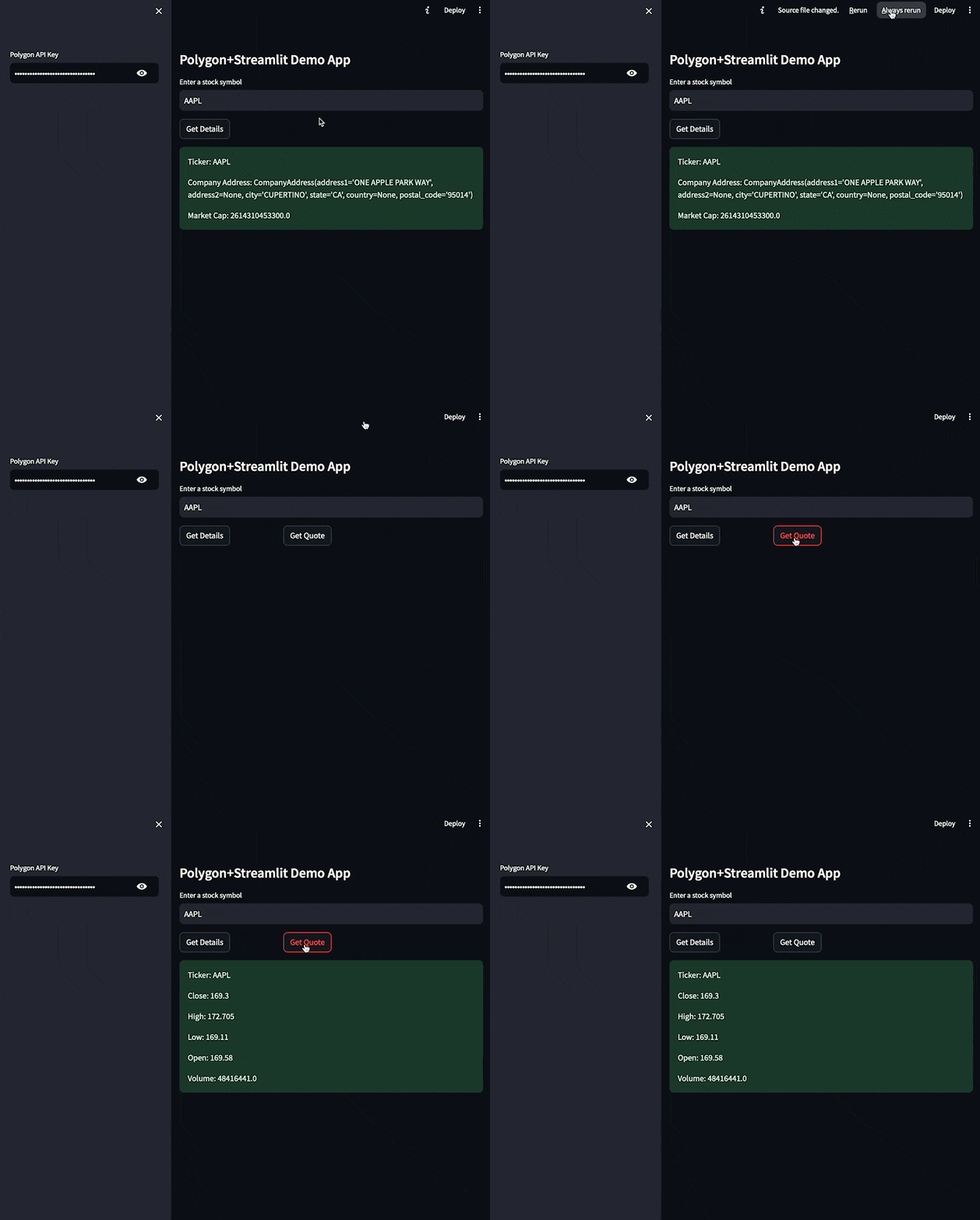
Let’s add another call, this time to fetch yesterday’s market data information. Again, we won’t format the results much yet, just display the results in a success field. Directly after your first if statement, add a new button and logic
#Current bid info
if col2.button("Get Quote"):
    if not polygon_api_key.strip() or not symbol.strip():
        st.error("Please add your Polygon API Key on the left <--")
    else:
        try:
            aggs = client.get_previous_close_agg(symbol)
            for agg in aggs:
                st.success(f"Ticker: {agg.ticker}\\n\\n"
                    f"Close: {agg.close}\\n\\n"
                    f"High: {agg.high}\\n\\n"
                    f"Low: {agg.low}\\n\\n"
                    f"Open: {agg.open}\\n\\n"
                    f"Volume: {agg.volume}")
        except Exception as e:
            st.exception(f"Exception: {e}")
Save your changes, and Streamlit will automatically refresh. If it doesn’t, simply tap the Rerun option at the top right.

Visualize Historical Data in a Chart
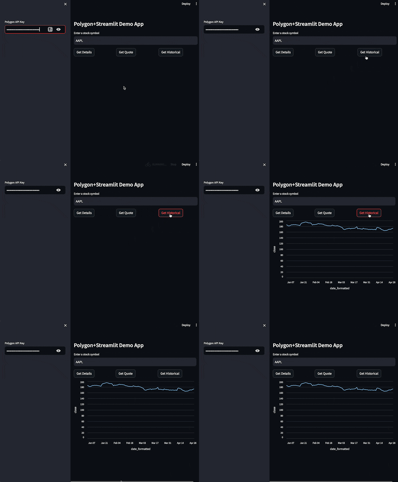
Now let’s get onto something a bit more visual. We want to map historical stock data into some sort of visualization. We are going to use a line chart to get started. Streamlit has provided a number charting options , or community developed components, you can use depending on your use case.
Go ahead and add the following code after the if statement for the Bid logic we added above
#historical data for the year
if col3.button("Get Historical"):
    if not polygon_api_key.strip() or not symbol.strip():
        st.error("Please add your Polygon API Key on the left <--")
    else:
        try:
            dataRequest = client.list_aggs(
                ticker = symbol,
                multiplier = 1,
                timespan = "day",
                from_ = "2024-01-01",
                to = "2024-04-29"
            )
            chart_data = pd.DataFrame(dataRequest)

            chart_data['date_formatted'] = chart_data['timestamp'].apply(
                          lambda x: pd.to_datetime(x*1000000))

            st.line_chart(chart_data, x="date_formatted",y="close")

        except Exception as e:
            st.exception(f"Exception: {e}")
Stepping through the code, we are fetching historical data for our ticker symbol for data from January 1st to April 24th and retrieving an end of day price for each day. Upon success, we map it to a pandas DataFrame. Streamlit charts use DataFrames for their data structures.
One extra bit of logic takes the timestamp returned by Polygon and converts them into something more human friendly, before finally adding the DataFrame to the line chart component and specifying which fields to bind to the x and y axis of the line chart. Save you changes and refresh the app to see the results.

Summary
That’s it! With just a few lines of code, you’ve created a data app that works with Polygon financial data. Streamlit is a great tool for data science use cases and makes working with visualizations incredibly easy. Check out more of the financial data access options on Polygon.io and sign up today, for free, and get started. If you want to grab the complete code from this tutorial, you can clone it from GitHub.
